This article is outdated and no longer accurate. Find up-to-date information about flexbox at HTML5 Please.
Note: There is no Part 2 to this introduction, as the Flexbox spec has been changed significantly since this post was written. I did, however, write up an introduction to the newer version of the spec, though I couldn’t really call it Part 2.
A portion of what we do as web designers involves arranging elements horizontally or vertically on the screen. As of yet, CSS lacks a suitable mechanism for this task. Enter CSS3 Flexible Box Module (“Flexbox” for short).
Flexbox is one of three W3C draft specs (as of this writing) dealing with general layout issues and has its strengths and weaknesses compared to the other two. But as it has already been implemented in Firefox (and I predict there is a good chance it will be implemented in Safari in some form), you might want to play around with it. Even if it doesn’t get implemented in anything other than Firefox, some of the principles regarding flexible available space have already been injected into the other modules. Plus, it’s pretty fun.
The draft describes Flexbox as:
[…] a CSS box model optimized for interface design. It provides an additional layout system alongside the ones already in CSS. [CSS21] In this new box model, the children of a box are laid out either horizontally or vertically, and unused space can be assigned to a particular child or distributed among the children by assignment of “flex” to the children that should expand. Nesting of these boxes (horizontal inside vertical, or vertical inside horizontal) can be used to build layouts in two dimensions. This model is based on the box model in the XUL user-interface language used for the user interface of many Mozilla-based applications (such as Firefox).
This is pretty clear. It implies two important things:
- No more abusing floats, and no more getting abused by floats
- We can create true flexible layouts, and the browser will do the calculations for us
Basically, Flexbox is a small part of XUL ported to CSS. Cool as it may be, I remain of the opinion that the power of Flexbox is in the layout of things like UI components (think forms and toolbars and such) rather than in general page layout. So let’s not get carried away and make Flexbox the new float. For general page layout, we need a true grid-based model; I’ll come back to that in the near future. For now, let’s dive in.
Flexbox gives us a new value for the display property (the box value), and eight new properties:
- box-orient
- box-flex
- box-align
- box-direction
- box-flex-group
- box-lines
- box-ordinal-group
- box-pack
Today, we’ll ease into this and just focus on box-orient and box-flex, and tackle the other properties in Part 2.
Let’s say we have three paragraphs, each of which introduces one of three product lines for a client website. Our designer has determined that these teaser paragraphs are to be placed adjacent to one another along a horizontal axis, essentially forming three columns.
    First child
    Second child
    Third child
How would you currently tackle this? Most, without thinking, would simply float these paragraphs, perhaps adding overflow:hidden; to the parent in order to clear the floats. Nothing very special. But we could also do it quite easily with Flexbox:
#products {
    display: box;
    box-orient: horizontal;
    }
In the above code, we’re simply telling the parent to behave according to this (flex)box model, and to lay out all its children along the horizontal axis. No floats. Yay.
box-orient accepts four values, but two of them are important for all intents and purposes: horizontal and vertical. Self-explanatory.
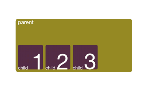
The widths of the children remain as specified (or their inherent width if not specified). This means that if the total widths of all the children is less than the total width of the parent, we’ll get something like this:

But what if you wanted paragraphs one and two to have specific widths and paragraph three to adjust itself depending on the available space within the parent? Flexbox to the rescue:
#products {
    display: box;
    box-orient: horizontal;
    }
    #fast-cars {
        box-flex: 1;
        }
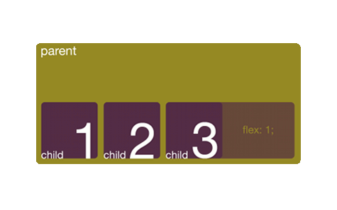
Here, we’re telling the last child to become flexible, and to take up available space. Since we’ve only allocated space to one element, it will take up all of the available space:

Note that the element only becomes flexible along the orientation axis of the box; in this case the element becomes flexible horizontally.
The value for box-flex is relative. So if we were to make the second and third children flexible:
#products {
    display: box;
    box-orient: horizontal;
    }
    #computers {
        box-flex: 1;
        }
    #fast-cars {
        box-flex: 1;
        }
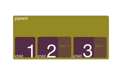
These would each take up the same amount of available space, in fact dividing the available space equally between them.

Should we give the last child box-flex: 3;, then it would take three times as much available space as the second child.
Check out the demo (this will only work in Firefox) or download the demo source code (.zip-file, 1kB).
Without even considering the other six properties, there are lots of possibilities here. Although I am not in favor of using this module for page layout, it can be done, as you can see in the demo.
We’ll get back to the other properties at a later date. In the meantime, if you want to play around with this, why not? It will only work in Firefox work in Firefox and (newer) webkit browsers; just prefix the display value and properties with -moz- or -webkit- respectively:
display: -moz-box;-moz-box-orient-moz-box-flexdisplay: -webkit-box;-webkit-box-orient-webkit-box-flex
Please be advised: this is meant to be a surface-level introduction to a draft spec. At the time of this writing, most people won’t find this applicable to anything outside of experimentation. There is, however, value in learning about the content of somewhat lesser-known working drafts, if only to be able to compare one to another.
Enjoy!

A Gentle Introduction to CSS3 Flexible Box Module (Part 1) by Stephen Hay is licensed under a Creative Commons Attribution 3.0 Unported License.
It is already included in webkit/safari/chrome. You need to use -webkit- prefix, but it’s all there. And it’s good! Flexible-box is the perfect way to do application/ui layout.
@saars: Thanks for catching my oversight. I’ve updated the post and the demo accordingly. :)
How about aligning one row with another one (as you would have to do when layouting forms)? For example:
label1 textbox1
label2 textbox2
If one lays out the rows with hboxes, can label1 and label2 be aligned?
There are several ways you could do this, but let’s say you just absolutely want to use flexbox somehow and have only labels and input fields to use. In your example, if you used the elements in this order:
then you could set the display of the labels to box (-moz-box or -webkit-box) and give them a width, as well as the form itself.
For example, set the form to, say, 600px, then the labels to width:50% and
display:-moz-box. That works just fine (at least when I tried it in Firefox), but then, doing the same withdisplay:inline-blockworks just as well, so flexbox is not really giving you any advantage here.This method is a simple starting point for some forms, depending on the content and structure of the code.
Eagerly waiting for part 2, Stephen!
It’s coming! They’re changing the draft though, so I’m waiting for that to happen; I may even need to revise Part 1 a bit. We’ll see.
Thank you so much! I had wanted to use -webkit-box, but wasn’t able to find documentation on what it does, or how to use it.
Not only did you give a good introduction to the module, but you also linked to the specification, which has some really cool stuff in it.
I was able to replace almost all the tables in my extension with flexbox, which significantly reduced the number of elements, while retaining the same functionality.
My markup is now much cleaner, since I no longer need silly CSS tricks/tables/wrapper divs to do the layout I wanted!
As an added bonus, my extension also scales somewhat better to (very) small sizes, than it did with tables.
Simple tutorial and very well written.
Thanks
Thanks for the article! This is exactly what I was looking for. Like saars said, these new features are perfect for UI and application layout. I’ll be using it right away to replace some javascript hacks I had been using.
Cheers!
Thank you for providing the information. It sounds like an exciting new CSS3 tool to use.
Actually I just need two things.
1. A property to make absolutely positioned(and floated) elements affect the height of the parent.
2. ‘base-with’ which is added to width.
Then I can do
section {
base-width:100px;
width:25%;
max-width:400px;
min-width:50px;
}
So width will grow between 150 to 500 pixels at a fourth of the rate of the parent.
I don’t think the box model gives me that. Although I think it is good for form layouts.
Thank you for the great information.
But how do you do both horizontal and vertical?
hi all,
i am a trainer in a big electronic firm, i have a project and i need your help. could you tell me how i can use them in opera?
“for example: display: box” is it valid in opera?
thank you
No. I’m afraid Opera does not yet support flexbox. For browser support, see http://caniuse.com/#feat=flexbox
thanks, now i don’t know how i’ll prepare it, if someone have idea, they can help me please. how can i transform this code for opera?